


How Oliphant Found Its Way Home
The story of a symbol, an elephant, a family name and the connections that brought them together.
Some things only make sense when you look back.
When I started developing what would eventually become Oliphant Designs, I thought I was moving towards a new chapter in my creative career. A new name, a more considered identity and a clearer expression of what I wanted my work to represent. What I didn't realise at first was how much of that identity was already connected to my past.
The further I looked, the more I began recognising things that had been there for years. Symbols, memories, ideas and even a family name that would eventually bring everything together. None of these connections had been consciously planned, which is probably what makes the story so interesting to me.
To understand how Oliphant Designs came about, I have to go back quite a bit further than the name itself.
It started with a symbol
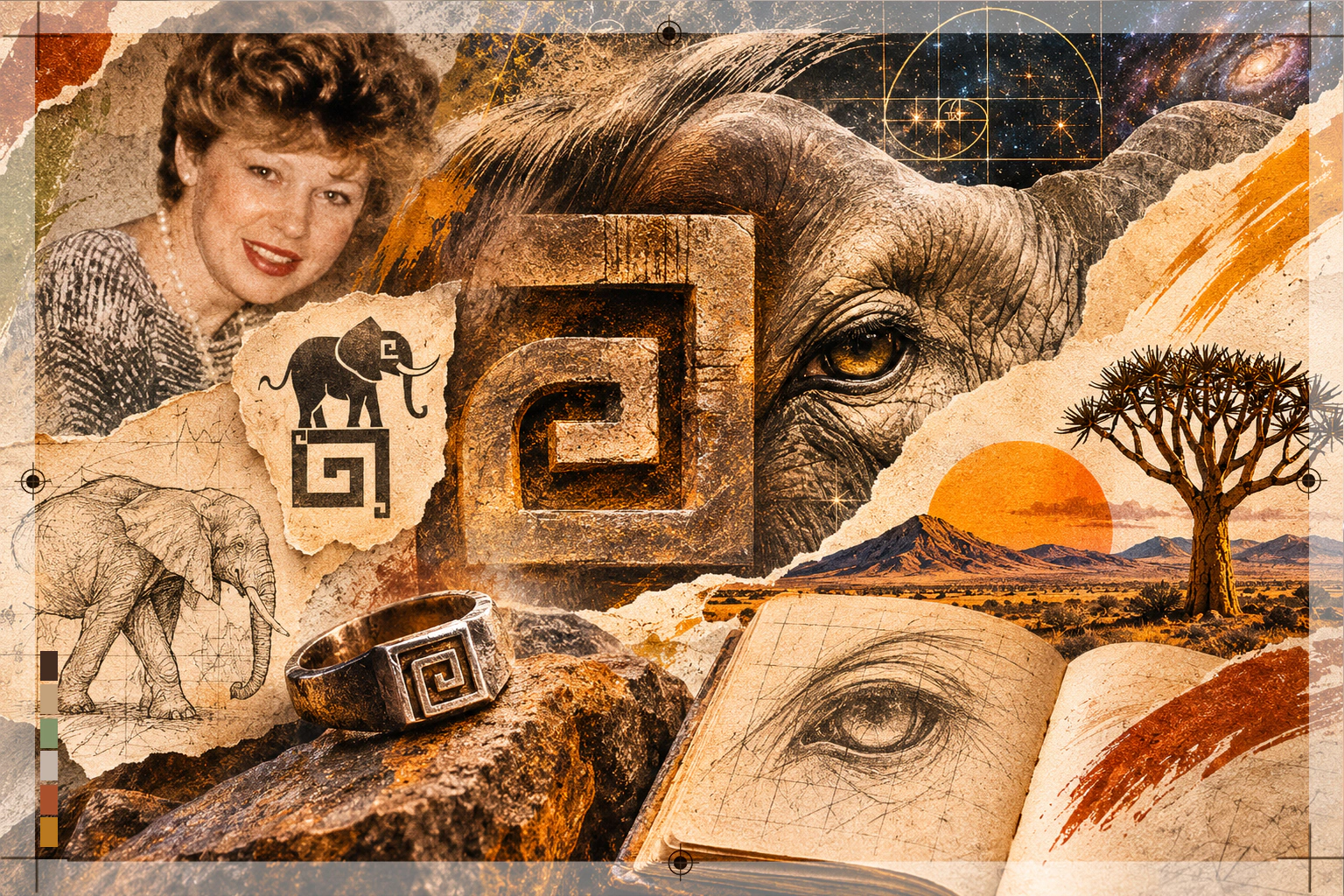
Long before the elephant appeared in my creative identity, there was a symbol that had fascinated me since childhood. It was a Roman symbol whose form brought together what I recognised as an uppercase G and a lowercase g. Those two letters carried a personal meaning for me, representing God and god, the Creator and creation, and the relationship between them.
It was something I connected with deeply enough that I wore the symbol on my ring finger for years. It wasn't part of a branding exercise or something I'd chosen because it looked interesting. It already meant something to me, long before I considered incorporating it into my creative work.
I've always been drawn to symbols and the meanings we attach to them. Why does a particular shape resonate with us? Why do some things feel significant even when we can't immediately explain why? I think that curiosity has influenced much of the way I see the world, and eventually, the way I approached design.
Looking back, I realise that this symbol was one of the earliest expressions of something that would become central to my creative philosophy: meaning matters. Sometimes we recognise it immediately, and sometimes we only understand it years later.
Then came the elephant
My creative journey took me to Cape Town, where I studied animation, before moving into newspaper design and production in 2006. Over the years, I worked across different areas of the creative industry, including advertising, branding and independent design.
But my relationship with elephants had already found its way into my imagination. In 2006, I wrote a story called Trading Shoes, about a boy and an elephant who exchange shoes and experience the world from each other's perspective. It explored empathy and the relationship between humans and nature, something that has always been important to me.
Years later, when I developed an early freelance identity called Gaia Namaste, the elephant appeared again.
Gaia represented Mother Earth, nature and our relationship with the world around us. Namaste reflected the recognition of something meaningful in another living being. Both ideas connected naturally with how I thought about life, creativity and our place within the wider world.
I've also always admired the way elephants live together. Their families are guided by matriarchs, whose experience and memory help the herd navigate the world, protect one another and care for the younger generations. Family has always been important to me, and those qualities of care, connection and remembering where we come from resonated with me too.
I decided to place an elephant above the symbol I'd carried with me since childhood. The two elements belonged together in my mind. The symbol already held meaning, and the elephant brought another expression of that connection to nature, life and understanding.
At the time, I wasn't thinking about how those elements might evolve over the following years. I was simply creating something that felt meaningful to me.
The eye, the sun and the changing identity
As my work developed, my creative identity changed with it. The elephant eventually disappeared from the logo, but the original symbol remained part of the visual journey.
Through that evolution, the symbol became an eye. And somewhere along the way, I recognised another connection: it was the eye of the elephant.
I find that fascinating because the symbol existed long before I'd placed an elephant above it. Yet through the evolution of the design, the two had become connected in a way I hadn't originally anticipated.
The identity continued to develop, incorporating the sun and other forms, while my business eventually became known as Morné Venter Designs. Different names, different visual expressions and different stages of my creative career, but certain ideas continued to follow me.
Nature, symbolism, connection and meaning were always present in some form.
I think that's something we sometimes overlook when developing a brand. We can become so focused on creating something new that we forget to look at what has already shaped us. The things we naturally return to, the ideas we care about and the symbols that keep finding their way into our work can tell us quite a lot about who we are.
Of course, not every design decision needs some profound explanation. Sometimes a shape works because it creates balance, or a colour works because it communicates clearly. But I've always believed there's value in being curious about why certain things resonate with us.
And that curiosity would eventually lead me somewhere unexpected.
The name that brought everything home
Oliphant is my mother's family name. It's part of my family history, connected to my grandfather and the generations before me.
When I began considering Oliphant Designs as the name for my creative studio, I was drawn to the personal connection. It felt grounded in something real, something that belonged to me beyond my professional identity.
But then I started looking back at the journey that had brought me there.
There was the symbol I'd connected with since childhood, the one I'd worn on my finger for years. There was the elephant I'd placed above it during the Gaia Namaste years. There was the way the symbol had evolved into an eye, and my later recognition of that eye as belonging to the elephant.
And now, after all those years, I was returning to the elephant through a name that had belonged to my mother's family all along.
And there was another connection I hadn't fully appreciated until then. The elephant I'd once chosen to represent Mother Earth was now returning through my mother's family name. Mother Earth, my own mother, the matriarchal nature of elephants and the importance of family in my life. Different threads of the same story, coming together in a way I could never have planned.
I hadn't planned any of it.
The elephant hadn't been chosen years earlier because of the Oliphant name. The symbol hadn't been created to represent an elephant. Those connections had developed at different times in my life, often without my consciously recognising how they related to one another.
Yet here they were, coming together.
What initially seemed like a new direction for my business began to feel like something quite different. I wasn't moving away from my creative history. In many ways, I was returning to it.
That's when I realised this wasn't really a conventional rebrand.
It was a homecoming.
Where meaning meets design
That experience helped clarify something I'd believed for a long time about design.
I don't think the strongest brands are always the ones that invent the most unusual identities or try hardest to stand out. Sometimes the most meaningful thing we can do is look more carefully at what's already there.
Every business has a history, people, experiences, values and reasons for existing. Some of those things are obvious, while others are much harder to recognise, particularly when you're so close to them.
As designers, we have an opportunity to observe those things, ask questions, recognise connections and help communicate what makes a business meaningful to the people behind it and the people it serves.
That doesn't mean we need to manufacture symbolism or attach elaborate stories to every visual element. In fact, I think doing so often takes us further away from authenticity. Meaning should be discovered where it genuinely exists, not invented simply to make something sound more interesting.
My own experience with Oliphant reminded me of that. I couldn't have planned those connections from the beginning because I didn't even recognise all of them at the time. They became clear through looking back, questioning and allowing the story to reveal itself.
And perhaps that's why the phrase Where Meaning Meets Design feels so appropriate to me. It describes the way I want to approach creative work, but it also describes the journey that brought the studio to where it is today.
Coming full circle
Today, the elephant has returned. The name has changed, the visual identity has matured and the studio has a clearer sense of direction. But the curiosity that started with a symbol in childhood is still there.
I still find myself noticing connections between things that, at first glance, seem unrelated. Nature, memory, psychology, culture, colour, symbolism and everyday experiences all have a way of influencing how I think and create.
And I still believe that good design begins with paying attention.
When I look back at the different identities I've created over the years, I no longer see them simply as old logos or previous versions of my business. I see different stages of a journey, each carrying something forward into the next.
The symbol came first. Then the elephant. Then the eye and the sun. And eventually, the family name that brought the elephant home.
It's rather remarkable how things sometimes come together when we finally recognise the connections.
Oliphant Designs represents that recognition for me. A connection to my family, my creative history, the natural world and the values that have shaped the way I work.
I started out thinking I was creating a new identity.
As it turns out, I was discovering one that had been there all along.
Where Meaning Meets Design.